Building a brand—and designing the guidelines that go with it—opens the door to hours of creative work, plenty of feedback, and even more opinions.
You’ve probably been here:
- A teammate or co-founder says:
“I don’t think pink is the right color for us.”
“I don’t like it.” - The designer walks you through their rationale:
“The curve represents expansion.”
“Purple signals luxury.”
“The logo leans forward to show momentum.”
“The palette is vibrant but grounded.”
Everyone’s trying to be helpful.
Everyone’s trying to be right.
And somehow, you end up stuck between two fake choices:
Subjective taste (“This doesn’t feel like us.”
Symbolic meaning (“The color means growth”)
Both sound legitimate.
Both feel like real feedback.
But neither tells you if your brand is going to work.
You start wondering:
Is this how I’m supposed to judge it?
Does any of this even matter?
Designers aren’t wrong to offer meaning
They often explain their work through meaning because it helps justify the investment.
“There’s a rationale for every shape, curve, and serif.”
And they’re right, meaning creates trust.
It shows there’s been thought, not just taste.
But there’s a deeper assumption hiding behind it:
That a logo should be meaningful.
And that’s where things get tricky.
Brands aren’t remembered for what their assets mean.
They’re remembered for what those assets got linked to over time.
For how they made you feel each time you saw them.
And for how often they showed up.
We don’t remember brands because their logo “leans forward” or because yellow is “optimistic.”
We remember them because their codes are instantly, unmistakably them.
Jenni Romaniuk’s piece in Marketing Week makes the point brilliantly:
Yet again and again, marketers over-engineer the symbolism:
The story behind the color.
The metaphor in the logo.
The cultural weight of the mascot.
But none of it matters if people can’t look at it and instantly say:
“That’s you.”
Recognition is the hard currency.
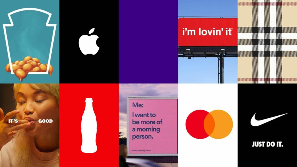
- When the Nike Swoosh was first created in 1971, it meant… nothing.
- Coke doesn’t need to justify red. But its bottle shape is recognizable across the globe.
- Same goes for Apple. If Apple weren’t Apple, the name would just be… a fruit.
Meaning is earned with time. That’s the payoff of keeping assets simple, famous, and relentlessly repeated.
A better question to ask:
Will people recognize us again?
Distinctive assets, your logo, colors, typography, shapes, aren’t judged on what they say.
They’re judged on:
- How different they are from others in your category
- How consistently you can use them
- How quickly people can link them back to you
That’s it.
Recognition first.
Meaning, if it comes, is earned over time.
Does this mean I should ignore design fundamentals?
Not at all.
There’s a baseline of design hygiene you can’t afford to miss,
especially in categories like tech, fintech, or digital services, where modernity is part of credibility.
You need to look like you belong in the category enough for people to trust you—
but be distinct enough for them to remember you.
- Distinctiveness ≠ randomness
- Recognition ≠ ugly
- Meaningless ≠ outdated
If you’re a tech startup and your logo looks like a fax machine brand from 1994—that’s a problem.
If you’re selling premium services and your fonts look default or your colors feel cheap— you’re signaling the wrong thing—before anyone reads a word.
But if your brand is “analytically empowering,”
that doesn’t mean your logo needs triangles and bar charts.